Themes
PAS gives you the ability to create themes and change the look of the authentication UI. A theme includes options such as colors, background and logo, both in light and dark mode.
This section deals with setting up theme JSON files and assets. Learn more about configuring themes in Appearance Profiles
Note
The working folder for all customizations is [install folder]/modsoverlay/com.phenixidentity~auth-http/web/web-app/, also abbreviated to /modsoverlay/.../web-app/ below.
Replicate this folder structure in your /modsoverlay/ folder if it does not yet exist.
Since /modsoverlay/ is not overwritten during install, any content in this folder will not be changed during future updates.
Creating Themes
You can chose to edit and override the default theme or create a new theme with a specific name.
Override the Default Theme
This will be the default theme for all authentication views if no specific theme has been specified.
Start with locating the original theme "default.json" in /mods/:
/mods/com.phenixidentity~auth-http/web/web-app/theme/default.json
Copy it to the corresponding directory in /modsoverlay/. Replicate the folder structure if needed:
/modsoverlay/com.phenixidentity~auth-http/web/web-app/theme/default.json
Do all modifications for the theme in "default.json" in /modsoverlay/.../web-app/.
Create a New Theme
Create a new JSON file in /modsoverlay/.../web-app/theme with the name of the theme, for example "my-theme.json". Replicate the folder structure if needed:
/modsoverlay/com.phenixidentity~auth-http/web/web-app/theme/my-theme.json
You can use the Theme JSON Reference or the original default theme file found in /mods/ as a template.
Learn more about applying custom themes in Appearance Profiles
Configuring a Theme
The theme JSON file consists two main sections, favicon configuration and color palettes.
All properties are optional, but are listed in the examples below even when empty for demonstration purposes. Any empty or omitted value will be ignored by the application.
Assets for the theme, like images etc., should be placed in /modsoverlay/.../web-app/ preferably in the /theme/ folder.
Note
When linking an asset in a theme JSON file, make sure the path to the asset file is relative to the /modsoverlay/.../web-app/ folder.
Favicon Configuration
"favicon": {
    "icon_png_16x16": "favicon-16x16.png",
    "icon_png_32x32": "favicon-32x32.png",
    "icon_png_48x48": "favicon-48x48.png",
    "icon_png_192x192": "favicon-192x102.png",
    "icon_apple_touch_png_180x180": "favicon-180x180.png"
}
To accomodate for the most common devices, use PNG files in each specified size, for example height 48px and width 48px for "icon_png_48x48".
In the favicon section, change each URL to your custom versions placed within /modsoverlay/.../web-app/.
Another option is to keep the configuration above and add files with the same names to /modsoverlay/.../web-app/. These files will then override the original files, for example:
/modsoverlay/com.phenixidentity~auth-http/web/web-app/favicon-16x16.png
Color Palettes
A theme can have two color palettes, light mode and dark mode.
"palettes": {
    "light": {
      "primary": "#22457A",
      ...
    },
    "dark": {
      "primary": "#22457A",
     ...
    }
},
Note
All values in the palettes section must be a valid HEX-color (#xxxxxx), unless it's an URL pointing to an image asset.
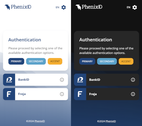
When arriving for the first time, the user's system setting will determine the mode. The user can then switch modes in the interface.
You can chose to only have one mode by leaving in just one of the palettes. This will force this palette for all users, regardless of system settings. The option for the user to switch modes will not be shown in the interface.
"palettes": {
    "light": {
      "primary": "#22457A",
      ...
    },
},
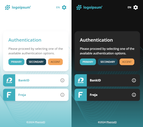
Palette Main Colors
A palette has three configurable colors:
- Primary: The most prominent color and the default for most UI elements when appropriate.
- Secondary: A complementary color for buttons.
- Accent: A complementary color for buttons with a strong call to action.
{
  "primary": "#22457A",
  "secondary": "#5BA2CA",
  "accent": "#F5AE30",
  ...
},
An example with custom color:
{
  "primary": "#3EAFBE",
  "secondary": "#1B4353",
  "accent": "#F5A65B",
  ...
},
Logo
{
  ...
  "logo": {
    "url": "theme/my-theme/logo.svg"
  }
  ...
},
Point to an image asset that you have put somewhere in /modsoverlay/.../web-app/. In the above example the url correlates to /modsoverlay/.../web-app/theme/my-theme/logo.svg. If the url property is removed or left empty, no logo will be displayed.
Note
Make sure the image asset has the appropriate dimensions (width and height) in relation the the rest of the interface.
Background
"background": {
  "header": {
    "color": "#3EAFBE"
  },
  "body": {
    "image": {
      "url": "theme/my-theme/background.png"
    },
    "color": ""
  }
},
Setting a value for the header color property will add a background color to the page header element.
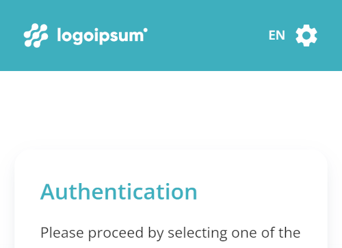
The page body can have a background image and/or a background color. If the body property has a value for a background image url, the following CSS will apply:
background-image: url([url to image asset]);
background-repeat: no-repeat;
background-size: cover;
Texts
"texts": {
  "headers": "#3EAFBE",
  "links": "",
  "settings": "#3EAFBE",
  "footer": "#FFFFFF"
},
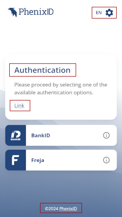
These properties let you override default text colors for the following elements:
Headers (<h1> to <h4>).
Links (<a>).
The settings icon and language indicator in the upper right corner.
The footer text.
Buttons
"buttons": {
  "primary": {
    "contained": {
      "label": ""
    },
    "outlined": {
      "label": "",
      "border": ""
    },
    "text": {
      "label": ""
    }
  },
  "secondary": {
    "contained": {
      "label": "#ffffff"
    },
    "outlined": {
      "label": "",
      "border": ""
    },
    "text": {
      "label": ""
    }
  },
  "accent": {
    "contained": {
      "label": ""
    },
    "outlined": {
      "label": "",
      "border": ""
    },
    "text": {
      "label": ""
    }
  }
}
},
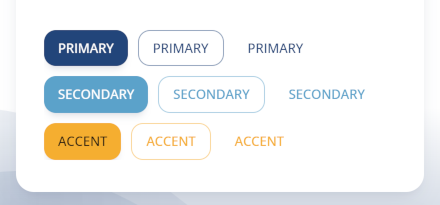
There are 3 kinds of buttons available:
- Contained
- Outlined
- Text
Each kind of button can have one of the 3 palette colors:
- Primary
- Secondary
- Accent
This configuration lets you override the default text color (label color) for each of these variants. For the "outlined" variant you can also override the default outline color.