Languages
The authentication module comes with two languages by default, Swedish and English. The language configuration makes it possible to override and extend the default languages as well as adding new languages.
This section deals with setting up language JSON files. Learn more about configuring languages in Appearance Profiles
Note
The working folder for all language customizations is [install folder]/modsoverlay/com.phenixidentity~auth-http/web/web-app/locales, also abbreviated to /modsoverlay/.../web-app/locales below.
Replicate this folder structure in your /modsoverlay/ folder if it does not yet exist.
Since /modsoverlay/ is not overwritten during install, any content in this folder will not be changed during future updates.
The examples below shows English, but any modifications needs to be done to all languages you plan to support.
File Structure
The default language files that come with the application are located in /mods/. This file structure applies to all languages, i.e. for English:
/mods/com.phenixidentity~auth-http/web/web-app/locales/en/default/default.json
To override and/or extend the default language file, add a new JSON file in in the corresponding directory in /modsoverlay/, for example "custom.json":
/modsoverlay/com.phenixidentity~auth-http/web/web-app/locales/en/default/custom.json
When the application loads, the "default.json" in /mods/.../web-app/locales/en/default will be merged with any file residing in /modsoverlay/.../web-app/locales/en/default, in this case meaning:
- Any identical JSON tree structure in "custom.json" will override and replace the corresponding tree structure in "default.json".
- Any new tree structure in "custom.json" will be added to the "default.json" tree structure.
Example
default.json
{
    "common": {
        "glossary": {
            "submit": "Submit"
        }
    },
    "authSelector": {
        "page": {
            "header": "Authentication"
        }
    }
}
custom.json
{
    "common": {
        "glossary": {
            "submit": "Send"
        }
    },
    "myCustomSelector": {
        "page": {
            "header": "My Custom Authentication"
        }
    }
}
Result after merge:
{
    "common": {
        "glossary": {
            "submit": "Send"
        }
    },
    "authSelector": {
        "page": {
            "header": "Authentication"
        }
    },
    "myCustomSelector": {
        "page": {
            "header": "My Custom Authentication"
        }
    }
}
Note that the value of "common.glossary.submit" has been replaced and "myCustomSelector" has been added in the resulting JSON.
Special cases
In special cases you can also create a new folder in /modsoverlay/.../web-app/locales/en/ and add a JSON file, for example:
/modsoverlay/com.phenixidentity~auth-http/web/web-app/locales/en/my-folder/my-file.json
In the backend configuration, you will then be able have the default.json be merged with any files in /modsoverlay/.../web-app/locales/en/my-folder instead of /modsoverlay/.../web-app/locales/en/default. That way you may include specific language files only under the circumstances you wish. Read more on how to do this in Appearance Profiles.
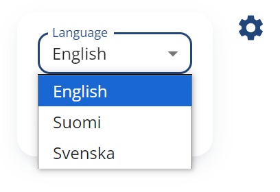
Add a New Language
Create a new folder named after the language code, (e.g., "fi" for Finnish), in /modsoverlay/.../web-app/locales/. Create a text file in this folder called "display_name.txt".
/modsoverlay/com.phenixidentity~auth-http/web/web-app/locales/fi/display_name.txt
In the text file, write how the language should appear in the language selector, for example:
Suomi
Copy the original "default.json" language file from either English or Swedish in /mods/.../web-app/locales/ and put it in a subfolder called "default" in the new language code folder:
/modsoverlay/com.phenixidentity~auth-http/web/web-app/locales/fi/default/default.json
Translate the content of the new "default.json" copy to the new language.
Language JSON Structure
Common
The "common" section of the language JSON contains texts shared across all views, such as commonly used words collected in a glossary, default feedback and date format for forms etc.
{
  "common": {
        ...

        "glossary": {
            "actionCancelled": "Action cancelled",
            "authenticated": "Authenticated",
            "back": "Back",
            ...
        },

        ...

        "form": {
            "togglePassword": "Show or hide password",
            "passwordShowing": "Password is showing",
            ...
        },

        "errors": {
            "generalError": "Something went wrong.",
            ...
        }
    }
},
Custom Error Messages
In the "common.errors" section you define any custom error message you have referred to in the admin configuration via a localization key.
If the localization key for example is "myCustomError", add it to your custom language file.
/modsoverlay/com.phenixidentity~auth-http/web/web-app/locales/en/default/custom.json
{
    "common": {
        "errors": {
            "myCustomError": "My custom error message",
        }
    }
}
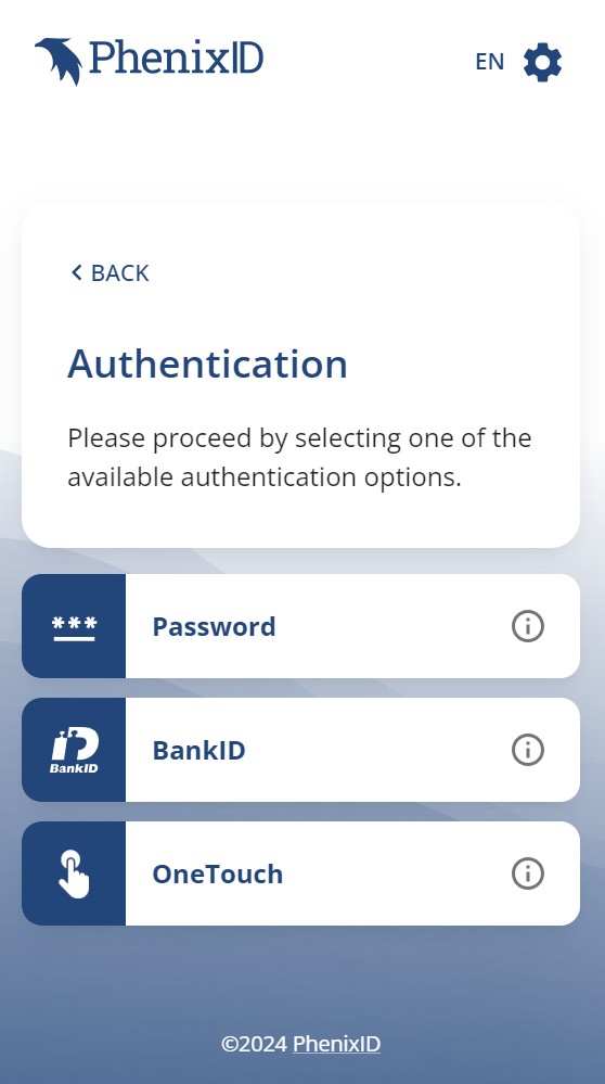
Authenticators
The text content for a specific authenticator is defined under its own section named after its localization key (localizationKey). Consider the localization key as a pointer in the JSON file.
Pre-configured authenticators, such as BankID and "Username and Password", have default localization keys and text content already defined. For example, "Username and Password" has the localization key "usernamePassword" in /mods/.../web-app/locales/en/default/default.json:
"usernamePassword": {
    "selectorItem": {
        "icon": "password",
        "label": "Username and Password",
        "tooltip": ""
    },
    "infoPopup": {
        "header": "",
        "body": ""
    },
    "page": {
        "htmlTitle": "Username and Password",
        "header": "Username and Password",
        "body": "",
        "form": {
            "username": "Username",
            "username_$invalid": "Please enter your username",
            "username_$helperText": "",
            "password": "Password",
            "password_$invalid": "Please enter your password",
            "password_$helperText": ""
      }
    }
}
Custom Authenticator Views
When creating a custom authenticator, such as a DynamicInputs view, configure the authenticator in admin to use a custom localization key.
Create a new section in the root of your custom language JSON file. For example if the localization key is "myFormPage" and the language is English:
/modsoverlay/com.phenixidentity~auth-http/web/web-app/locales/en/default/custom.json
{
    "myFormPage": {
        "selectorItem": {
            ...
        },
        "infoPopup": {
            ...
        },
        "page": {
            ...
        }
    }
}
Do this for all languages you plan to support.
Each authenticator can have three sub sections: selector item, info popup and page content.
Selector Item (selectorItem)
"selectorItem": {
    "icon": "password",
    "label": "Password",
    "tooltip": "Read more"
},
Here you define how the authenticator should appear if it is listed as an option in a selector page.
- icon: The list item's icon id.
- label: The list item's text.
- tooltip: If the item should have an information popup (see below), this will be the tooltip for the info button on the right.
These are the icon ids you can chose from:
| Icon | Id |
|---|---|
 |
default |
 |
amazon |
 |
bankid |
 |
certificate |
 |
efos |
 |
eidas |
 |
entraid |
 |
federation |
 |
feitian |
 |
fido |
 |
frejaorgid |
 |
google |
 |
googleauth |
 |
list |
 |
microsoftauth |
 |
nias |
 |
norskbankid |
 |
otpmail |
 |
otpsms |
 |
otpvoice |
 |
password |
 |
qrcode |
 |
register |
 |
sambi |
 |
siths |
 |
skolfederation |
 |
smartcard |
 |
sms |
 |
svenskeid |
 |
swamid |
 |
vipps |
 |
windows |
 |
yubico |
Information Popup (infoPopup)
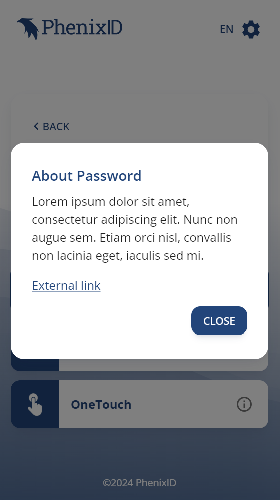
"infoPopup": {
    "header": "About Password",
    "body": "<p>Lorem ipsum dolor sit amet, consectetur adipiscing elit. Nunc non augue sem. Etiam orci nisl, convallis non lacinia eget, iaculis sed mi.</p><p><a href=\"https://www.google.com\" target=\"_blank\">External link</a></p>"
},
This is an optional feature. If this section exists and "body" has any content, an information icon will appear to the right in the selector item. Clicking this icon will display a popup containing that content. The "body" property supports basic HTML and Markdown.
Page
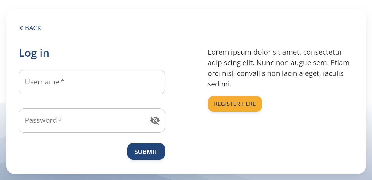
"page": {
    "htmlTitle": "Log in",
    "header": "Log in",
    "body": "<p>Lorem ipsum dolor sit amet, consectetur adipiscing elit. Nunc non augue sem. Etiam orci nisl, convallis non lacinia eget, iaculis sed mi.</p><p><a href=\"/register\" target=\"_blank\" data-button=\"contained\" data-button-color=\"accent\">Register Here<a/></p>"
    ...
},
The page section contains the text for the actual authenticator page. All pages need to have an html page title defined. Properties named "body" supports basic HTML and Markdown.
Forms
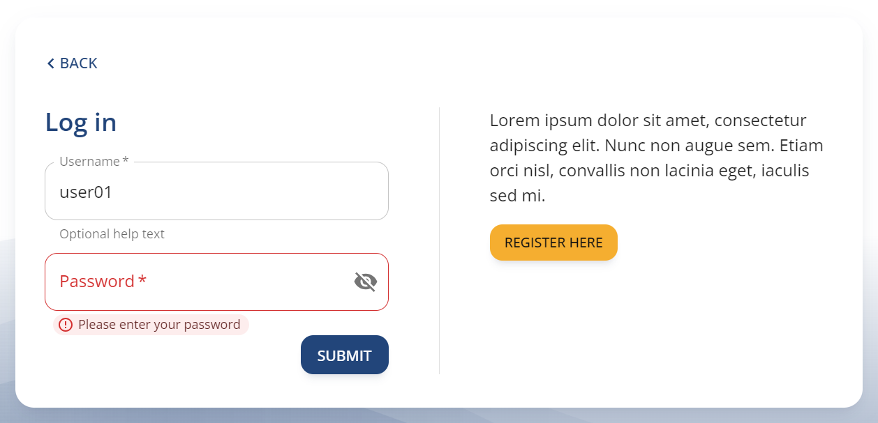
"page": {
    ...
    "form": {
        "username": "Username",
        "username_$required": "Please enter your username",
        "username_$invalid": "",
        "username_$helperText": "Optional help text",
        "password": "Password",
        "password_$required": "Please enter your password",
        "password_$invalid": "",
        "password_$helperText": ""
      }
},
When configuring DynamicInputs in admin, you can chose to populate input labels via localization keys. Put any localization keys referencing dynamic inputs in a sub section of "page" called "form".
In the above example "username" refers to the input's name attribute and populates its label with the corresponding text.
<label for="some_id">Username</label>
<input id="some_id" name="username" type="text" required>
For each form element, you can also override the default error messages and add a helper text.
Required value - Add a property in the "form" section corresponding to "[name]_$required", for example "username_$required". This will be displayed below the input element if the user leaves a required field empty. If this property is omitted or empty, the default error message will be displayed.
Invalid value - Add a property corresponding to "[name]_$invalid", for example "username_$invalid". This will be displayed below the input element when the user tries to submit an invalid value. If this property is omitted or empty, the default error message will be displayed.
Helper text - To display an extra helper text below an input, add a property corresponding to "[name]_$helperText", for example "username_$helperText".
HTML and Markdown
Properties named "body" support basic HTML, CSS and Markdown. The value is sanitized with DOMPurify before written to the page.
Buttons
If you want a link to be presented as a button, you can use the "data-button" attribute in the <a> tag. The value of this attribute can be one of the three button types:
- contained
- outlined
- text
"page": {
    "body": "<a href=\"https://www.google.com\" target=\"_blank\" data-button=\"contained\">Button Text<a/>"
},
Note
When adding HTML, make sure to escape special characters, such as " (double quotes) with a \ (backlash)
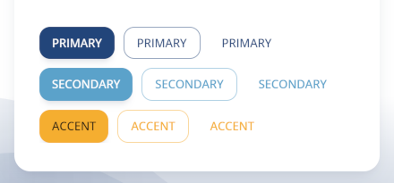
The default color of the button is the theme's primary color. To explicitly set the button color, use the "data-button-color" attribute with one of the theme's palette color values:
- primary
- secondary
- accent
"page": {
    "body": "<a href=\"https://www.google.com\" target=\"_blank\" data-button=\"outlined\" data-button-color=\"accent\">Button Text<a/>"
},